2024-12-05
Our script for issue 1 of Street Fighter X Darkstalkers has been approved and is with the interior artist, Alberto Alburquerque (Street Fighter Lily, Darkstalkers: Jedah)
i’m SOOOO Excited for you all to read this series!
2024-12-03
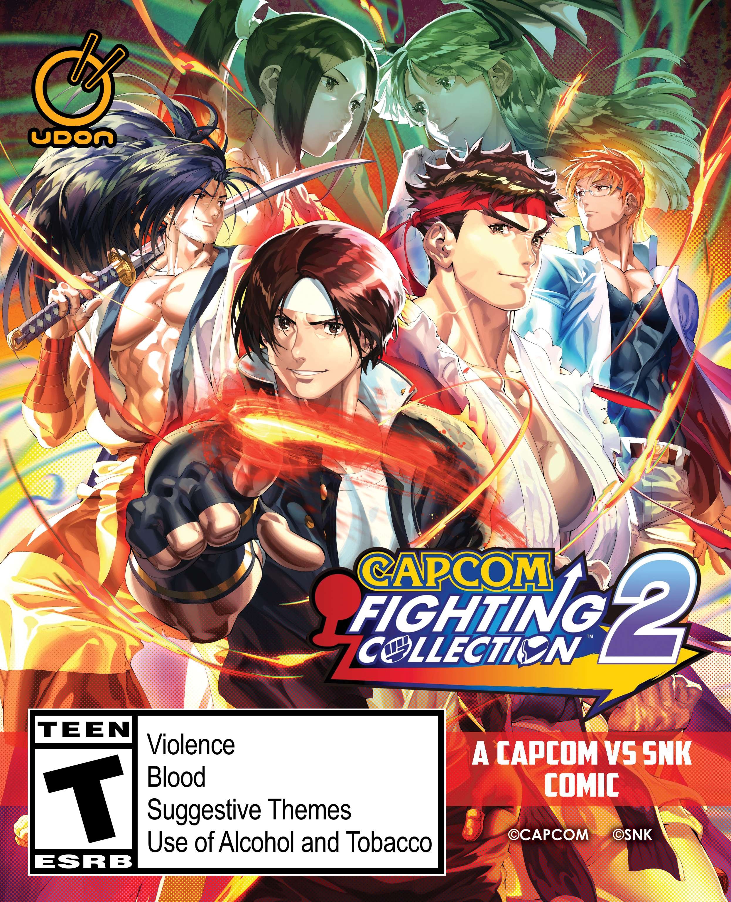
Starting today, pre-order the physical edition of Capcom Fighting Collection 2 for PS4 or Switch and get ready to battle! Secure your copy and get a 48-page Capcom vs. SNK comic in the box* while supplies last! *Available in the US (other regions TBA)
2024-11-15
Our Darkstalkers comic has been rebranded as DarKstalkers X Street Fighter because we have so many Street Fighter characters in it. WOO HOO!
2024-11-01
Big news!
I am co-writing the next Darkstalkers comic book series with Tim Seeley.
look for it to debut in April 2025!
2024-10-16
Font making can be an arduous task. One of my idols, Clem Robins (Hellboy), has been refining the same font for a couple decades. Taking a page from his PLAYBOOK, I have been meticulously updating one of my fonts, “Comic Wayward” for, well, at least 14 years. I have used this font for Jim Zub’s & Steven Cummings’ WAYWARD comic book (Image Comics) (for which the font is now named) as well as Brian Pulido’s Lady Death (Coffin COMICS).
Here’s a look at the font:
The font is available on My fonts.com at this LINK and comes with regular, italic, bold italic, 2 runic variants, and a typeface I call “ALIEN magic”.
*Note, this is an update of the font previously called “MD Villiage” or “MDV MKE”.
2024-10-05
I’ve published a book of writing prompts!
This book includes 2 unique things…1 the 451 writing method where you pick 1 of 4 protagonists, 1 of 5 genres, and 1 subgenre. There are even optional rules for those of you who are tabletop gamers and have multi-sided dice to help you make decisions.
This book also includes the 5 star evaluation system to see if your writing has the “legs” to be developed into something more!
Sometimes I look at a logo I designed and think… Damn, I love those Ss.
A couple weeks ago I visited retailers in Fort Wayne, Indiana where I reconnected with Dawn and Desy of Summit Comics & Games (summitfortwayne.com). I originally met them at ComicsPRO 2024. They have a FANTASTIC, well-lit, and clean shop that's very inviting to all crowds. They also have an amazing board game section!
Note, the #darkstalkers pictured is a rare retailer gift. Only 250 copies exist and less than 20 of those are in the wild at the moment.
I've been visiting retailers lately and popped into Tardy's in Grand Rapids, Michigan where I met co-owners Gavin and Deanna and their partner from the Allegan location, Kort. They're great guys! VERY kind and helpful. Thanks to Steve Seeley for recommending I visit them!
Note, the #darkstalkers comic we're holding is a rare retailer gift. Only 250 copies exist and less than 20 of those are in the wild at the moment.
Here’s something new I’m working on…
I created the emblem for the John Carter of Mars audio series. Check it out!
Here's your Friday update to my How To letter Comics YouTube channel! (Featuring art from Startup, a comic I letter for SitComics) This episode: Overprinting Blacks!
Here's something from a recent tutorial I recorded...Find out more at youtube.com/c/HowToLetterComics
I've posted a comic book lettering tutorial using my template and basic comic book lettering fonts using Adobe Illustrator.
I’ve (finally) claimed my custom YouTube channel URL! youtube.com/c/HowToLetterComics
The ink isn’t yet dry on the contract…but I’ll just put this here anyway… WOOT!!
Here’s a modified Lady Death logo I recently did for Brian Pulido at Coffin Comics. The idea was to make it look more EVIL and devil-like thank the traditional logo (yet be VERY similar so we don’t go “off-brand”) to reflect things happening in the story. It worked well and Brian and the crew loved it, so that’s a win!
Great news! I’m the series letterer on Skull Kickers and I’ve loved every minute of it.
More details here: http://www.jimzub.com
My friend, Jason Shawn Alexander, did amazing portraits of the Killadalphia crew. Here’s Mine!! Buy his art. Follow him on Instagram.
I just posted a FREE downloadable version of TRAVERSE to my shop:
Just for fun.
My buddy, Josh Ellingson, is AWESOME!
Check out his customizable glow in the dark black and white TV bins!
https://www.indiegogo.com/projects/glow-in-the-dark-tv-pin?fbclid=IwAR2jeq8rZKTSVByOcjETJtUSmcholo1IWoKx7EGcLQLi-xa_W9badIOFa1c#/
I've been interviewed by Marco Lopez over at www.monkeysfightingrobots.com
New stuff! I've added some new lettering samples and created an inking section!
Colorists, here are a few tips from a production standpoint that will improve the way your work looks in print... (All of this is said with love and not with anger, just in case I come across preachy.)
If your work is printing darker than you'd like find out the printer's color conversion specifications and use them. Typically this is an easy action to set up that reduces your deep saturation to a standard maximum threshold while shifting your colors only as much as necessary (I know that scares you, but it shouldn't).
To explanation, printing is done with 4 inks: Cyan (C); Magenta (M); Yellow (Y); and Black (K). Each of those color channels could have 100% opacity / fill in any given area. If that were the case those areas would have 400% color saturation. This is a serious NO-NO. No paper can handle 400% color. Various printers, presses, and paper stocks can handle various amounts so you need to ASK YOUR EDITOR. If they don't know what you're talking about ask their graphic designer. If the designer doesn't know or if they don't have one ask the letterer. If you don't have any of these people in the chain of command muddy colors are the least of your worries.
I typically work with 305% as my max ink limit. It's more than some printers like which contributes to a little darkness, but it helps keep those dark areas rich. If anyone in the chain of command tells you to do less than I use you should do what they say.
Note: I don't do this for every book I work on. It is in fact NOT the letterer's job. It may not be the colorist's job either, this is up for debate. But things like this should be handled as early in the process as possible and since the colorist is an artist they should have the most stake in their work being represented as intended, so the onus is on them (you). Some clients adjust the max ink limit before sending me color art. Some never give me color art because they merge the lettering and final color art in-house. And occasionally I work on books for years and years. In these cases I often started working on them before I knew much about this issue, since no one is complaining there's no problem.
Here's another tip, work in good lighting and with a dark monitor (turn your brightness down). If you're in a dark room and your monitor is cranked up to 11 you'll be seeing bright colors on screen that you'll never see in print. On a Mac set your brightness set to 1/2 way (I have no idea for a PC or Cintiq). As a rule of thumb, a LIGHT monitor means a DARK print and a DARK monitor means a LIGHT print.
Cheers!
Welcome to First Draft Press.net
April 18th, 2016
I just watched an episode of FIRST PEOPLES that stated we can (could have) mate(d) with any ancestor up to 2 million years removed from ourselves. This was determined by examining genetic drift in various populations.
We know we've mixed with Neanderthals and Denisovans. There's genetic proof of this. But this 2 million year figure opens our ancestry up to dozens of hybridizations. It's fair to say that hybridization is the primary agent that defines what a "human" is.
There is evidence in the Middle East of Sapiens and Neanderthals co-existing for 10,000 years. WOW. Just WOW. The Neanderthals weren't killed off, they weren't out matched. They were blended in to the Sapiens species. We're not talking about a one-off mating, or something that happened in isolated parts of Europe. We're talking about a re-weaving of genomes into a single fabric. It happened in the Middle East, It happened deeper in Asia and it happened is South East Asia (on the way to Australia).
If you listen to modern news or follow politics you'll see people trying to find ways to divide humanity into US vs THEM. It's all bullshit. It's all smoke and mirrors. We're all joined in an amazing family tree. While I lament the lack of a variety of human species co-existing today, I'm proud that what we collectively are is a blending of all human species throughout time.
We are one people.
March 12th 2016
Still under construction. I'm pretty busy being a dad and a freelancer , so bear with me.
March 6th 2016
GREETINGS EARTHLINGS!
Big changes are coming to this site. soon. I'll be streamlining things and updating more often. You may have noticed we've stopped producing our podcast. The demands of fatherhood have really reset my priorities, something had to give. LOTS of things had to give actually, and the podcast was one of them.
Stay tuned!
February 17, 2015
Thoughts on Chapter 1
Nothing is perfect, especially in the act of creation. While it may seem like a negative mindset to pick out flaws in one’s work it’s how the artist takes yesterdays crap and makes it into tomorrows soil. Through identifying parts of our work we consider weak or even bad we can transform the work, ourselves, and our outlook on the work. This is especially possible in writing, where whole passages can be reworked, or tossed out in favor of a new, better passage. It’s akin to cutting out a cancerous organ and then 3d printing a new one on the spot.
Since the goal of First Draft Press is not to be perfect, but to get work out there I’m noting some areas that I think chapter 1 could be improved, and then moving on to chapter 2. Someday, when the whole first draft is in the can I can revisit the novella with my notes in mind and hopefully produce a 2nd draft that’s been reworked and is better for it.
Description
I need more and better description in chapter 1. We know northing about what the goblins are wearing. We know little about the setting. What time of year is it? It seems like there’s little water, are we in a drought? Did I SAY we are in a forest? Did I describe the trees? Are we on a road, a trail, or is the wagon wedged in a stand of trees? Did I properly convey the socio-economic position of the goblins? How could I illustrate that by highlighting the ad-hock clothing and gear they have? Can I add some worldly texture by describing a breastplate from a dwarven sentry, feathers from an elven bow, nickers from a human prostitute?
3D characters
When having 3 adversaries, all of the same race and NOT defining their personalities and physical peculiarities you are by definition being stereotypical. You are relying on the reader’s assumptions of what that type of character is, rather than showing the reader what the characters are to you and to your story. They need distinct personalities, voice, physical descriptions, height, weight, skin shade, scars, mannerisms, prized possessions, agendas. Even if these don’t all get spelled out in the narrative, knowing someone has a love of tarnished copper that they can slowly polish up a luster may influence what they do / say / think, and that’s important.
On the nose dialogue
It’s been pointed out in my other writing that I have my characters say pretty much exactly what they mean and mean pretty much exactly what they say. Meaning, there’s almost no subtext. No one is lying, or hiding anything, it’s all out there for everyone to see. I’m not sure how to address this. It might be that I do two passes, first writing as I have and then re-writing to obfuscate things. But it might be better if I write it in two different chunks. The first chunk being the reality of their thought, the second being what they’re saying for others to hear. Once I know all the ins and outs of the characters it’ll help me to write dialogue that’s more individually appropriate, holding back what they’d hold back and saying things in the ways they’d say them.
Comic scripts vs pros writing
I think that all of these can be tied to my familiarity to comic book writing, not to bag on the way comics are written, because the better ones take into account all the things I’ve said above. I, however, have spent the last 20 years looking at things from the inside. I’ve been lazy in my reading and my appreciation of the comic book medium. In a comic, the writer rarely gives more than a brief nuts-and-bolts description of a scene, leaving it to the artist to flesh out all the details. This is how comics work, it’s collaborative and that’s a necessity, not a criticism. In this instance the artist is actually a co-writer. They’re adding all the bits of story that deal with setting, background, characters, etc. They’re also adding all the scene / setting drama via light and camera angles. In pros, however, the writer is the singular creator. Everything is on their shoulders.
Coming from he comic book background, and knowing my relationship with it, I might begin writing in layers.
From the bottom up the layers might be:
1 — PLOT.
Basic structure of things, what must happen and in what order to move the story to a gratifying conclusion.
2 — BLOCKING.
Literally the “character 1 moves here and does this. Character 2 reacts in this way” This is more or less the way a comic script (minus dialogue) reads, and it’s a bit how chapter 1 reads. Essential dialogue like Character B: “LOOK OUT FOR THE FALLING TREE!” would go in this layer.
3 — MOTIVATION.
Go through and make notes about characters motivations and how their actions are affected by those motivations. This layer might contain the “true thoughts” of characters. If Character C doesn’t want to want people of the falling tree it’d be noted here.
4 — TEXTURE.
This’d be the layer that nails down all the description and dialogue. This is everything that’s seen / heard / tasted, etc. This is also where you’d have all the dialogue descriptors like “He said with a huff” or “through gritted teeth he growled,”
I’m not sure yet if I’ll implement the layer method. I think it’s very interesting and highly functional, but it means writing the same story four times just to achieve a first draft, also, as you read through for layer 3 you’ll be compelled to rewrite layers 1 and 2… so maybe not. This approach might work better in a workshop or on a team of writers. We will see.
If you’re still reading this, THANK YOU. Knowing someone’s reading means I have a reason to continue to write besides my own vanity.
Cheers.


